Flexbox is a powerful layout tool in CSS, enabling you to create flexible and responsive designs that adjust smoothly to different screen sizes. By understanding how Flexbox properties work, you can eliminate layout headaches and build efficient, adaptive web pages.
Flex Container and Flex Items
Flexbox introduces the concept of a flex container and its flex items.

When you set a parent element’s display value to flex, it automatically makes all its child elements flex items, ready to be aligned and arranged along a specified axis.
.flex-container {
    display: flex;
}

.flex-items {
    flex: 1; /* more about this in next week! */
}
Main Axis and Cross Axis
Flexbox layouts are controlled along two axes:
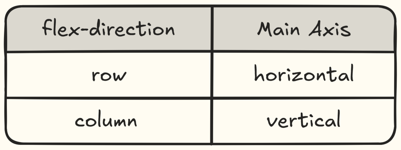
Main Axis: The primary axis along which flex items are laid out. By default, this is horizontal (
row), but you can change it with theflex-directionproperty.Cross Axis: The axis perpendicular to the main axis, used for aligning items vertically (
column).
Setting the Main Axis with flex-direction
The flex-direction property controls the direction of the main axis in a flex container.
Since flex items always align along the main axis, changing its direction effectively changes how the items are laid out.
Why is this useful?
Understanding the main axis direction helps us predict how flex items will behave.
justify-content: aligns items along the main axis.align-items: aligns along the cross-axis.
This makes it super easy to dynamically center items or change the layout orientation without additional CSS changes.
flex-direction: row (Default)
By default, the main axis is horizontal (a row), so flex items are laid out from left to right.
.flex-container {
    display: flex;
    flex-direction: row; /* Default value */
}
By default, the main axis is the horizontal (row).
flex-direction: column
When you set flex-direction to column, the main axis switches to vertical, stacking flex items from top to bottom.
.flex-container {
    display: flex;
    flex-direction: column;
} 
When you set flex-direction to column in Flexbox, it changes the main axis to a vertical orientation.
Now, when you use properties like justify-content, it will align items vertically (along the main axis) and align-items control horizontal alignment (along the cross axis).
Example Time!
Using justify-content with Default Direction (Row)
<div class="flex-container" style="justify-content: center;">
    <div class="flex-item">Item 1</div>
    <div class="flex-item">Item 2</div>
    <div class="flex-item">Item 3</div>
</div>
justify-content: center
🔎 Learn more about justify-content property
Using align-items with Column Direction
<div class="flex-container" style="flex-direction: column; align-items: center;">
    <div class="flex-item">Item A</div>
    <div class="flex-item">Item B</div>
    <div class="flex-item">Item C</div>
</div>
align-items: center
🔎 Learn more about align-items property
Quick-Recap
The flex-direction property determines the main axis of a Flexbox container.

Setting it to row makes the main axis horizontal, while setting it to column switches the main axis to vertical.
A quick overview of how justify-content and align-items work in Flexbox.

justify-content aligns items along the main axis, while align-items takes care of alignment along the cross axis.
Summary
In this post, we’ve covered how Flexbox’s main and cross axes work and explored the alignment properties justify-content and align-items.
Understanding these fundamentals gives you powerful control over the layout, making it adaptable across various screen sizes.
Stay tuned for Part 2, where we will dive into properties like flex-grow, flex-shrink, and flex-basis, which allows finer control over how flex items behave within the container.

